
The Psychology of Colors in Headshot Photography


How the colors you use in your headshot can effect the viewers perception of you
In the realm of headshot photography, every detail matters—lighting, composition, expression, and, even color. The colors you choose to incorporate into your headshot, whether through your clothing, background, color-grading or lighting, can significantly influence how others perceive you. This is where the psychology of colors comes into play. Understanding how different colors evoke specific emotions and perceptions can help you make more informed choices, ensuring that your headshot communicates the right message to your audience.
The Power of Color in Visual Perception
Color is one of the most powerful tools in visual communication. It has the ability to evoke emotions, convey meaning, and even influence behavior. In headshot photography, color can enhance the viewer’s perception of your personality, professionalism, and brand identity. Whether you’re aiming to project confidence, approachability, creativity, or authority, the colors you choose can help reinforce these qualities.
However, the impact of color is not universal. Cultural differences, personal experiences, and individual preferences all play a role in how colors are perceived. Despite these variations, there are general psychological associations with certain colors that can guide your choices in headshot photography.
Research on color-in-context theory explains that “color conveys symbolic information about personality and context, not just aesthetic value”
Warm Colors: Red, Orange, and Yellow
Warm colors, such as red, orange, and yellow, are known for their ability to evoke strong emotions and create a sense of energy and warmth. These colors can be particularly effective in headshots if you want to convey passion, enthusiasm, and positivity.
• Red: Red is a powerful color that commands attention. It’s often associated with passion, energy, and confidence. In a headshot, wearing red can help you stand out and project a sense of determination and boldness. However, red can also be perceived as aggressive or domineering, so it’s important to balance it with other elements to avoid overwhelming the viewer.
• Orange: Orange is a warm and inviting color that combines the energy of red with the friendliness of yellow. It’s often associated with creativity, enthusiasm, and approachability. Wearing orange in a headshot can make you appear more dynamic and open, which can be particularly effective if you’re in a creative or people-oriented industry.
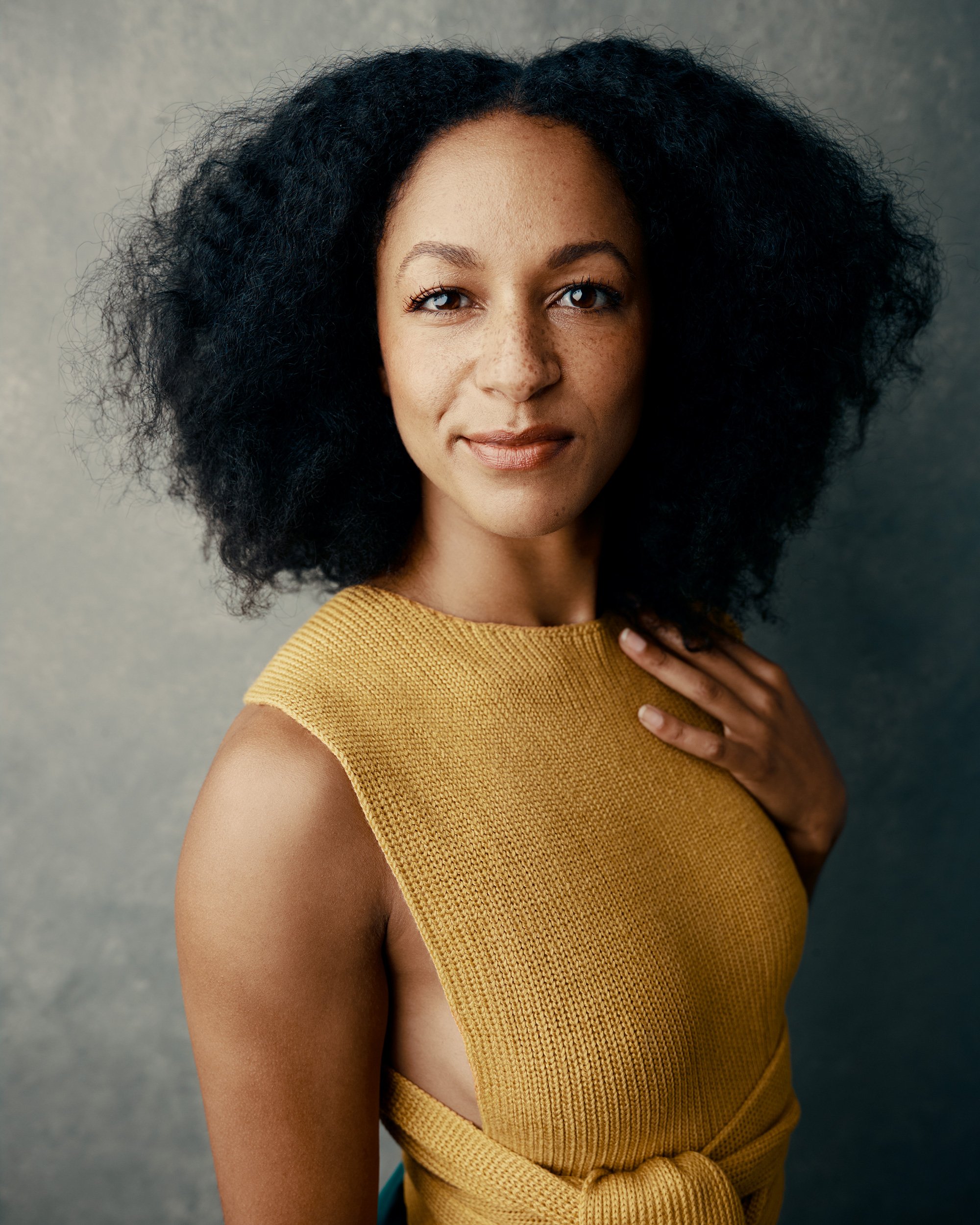
• Yellow: Yellow is the color of optimism and happiness. It’s bright, cheerful, and attention-grabbing. In a headshot, yellow can convey positivity and warmth, making you seem more approachable and friendly. However, because yellow is such a bright color, it’s important to use it sparingly to avoid distracting from your face.

Cool Colors: Blue, Green, and Purple
Cool colors, such as blue, green, and purple, are often associated with calmness, professionalism, and stability. These colors can be particularly effective in headshots if you want to convey a sense of reliability, trustworthiness, and sophistication.
• Blue: Blue is one of the most universally liked colors, often associated with trust, professionalism, and calmness. In a headshot, wearing blue can help you project a sense of dependability and confidence. Lighter shades of blue can make you appear more approachable, while darker shades can convey authority and stability. Blue is a great choice for corporate headshots or for industries where professionalism is key.
• Green: Green is the color of nature and is often associated with growth, balance, and harmony. In a headshot, green can convey a sense of calmness and approachability. It’s a versatile color that can be used to project a grounded and balanced personality. Green can be particularly effective if you’re in a health or wellness industry, as it’s often associated with healing and tranquility.
• Purple: Purple is a color that combines the stability of blue and the energy of red. It’s often associated with creativity, luxury, and wisdom. In a headshot, wearing purple can help you project a sense of sophistication and originality. It’s a great choice for creative professionals who want to convey a sense of innovation and uniqueness.

Neutral Colors: Black, White, Gray, and Brown
Neutral colors, such as black, white, gray, and brown, are often used as background colors or as part of the clothing in headshots. These colors can convey professionalism, elegance, and simplicity, making them versatile choices for almost any industry.
• Black: Black is a color of power, elegance, and sophistication. It’s often used to convey authority and professionalism. In a headshot, wearing black can help you project a sense of seriousness and confidence. However, because black can sometimes appear harsh or distant, it’s important to balance it with other elements, such as a warm expression or soft lighting.
• White: White is the color of purity, simplicity, and cleanliness. It’s often used to convey a sense of clarity and openness. In a headshot, wearing white can help you project a clean and professional image. White backgrounds are also common in headshot photography because they create a neutral, distraction-free space that keeps the focus on the subject.
• Gray: Gray is a neutral color that combines the seriousness of black with the calmness of white. It’s often associated with professionalism, reliability, and balance. In a headshot, gray can convey a sense of neutrality and sophistication, making it a versatile choice for a wide range of industries.
• Brown: Brown is a warm, earthy color that is often associated with reliability, stability, and approachability. In a headshot, wearing brown can help you project a grounded and trustworthy image. However, because brown is a muted color, it’s important to use it thoughtfully to ensure that your headshot doesn’t appear dull or outdated.

Creative Use of Color: Pushing Boundaries in Headshot Photography
While traditional color choices in headshots are often rooted in the psychology of color, there’s also room for creativity and experimentation. Depending on your industry and personal brand, you might want to push the boundaries a bit with more creative uses of color.
• Gelled Lighting: Gelled lighting involves placing colored gels over the lights used in your headshot to create a specific color effect. This technique can add a dramatic and creative flair to your headshot, making it stand out from more traditional images. Gelled lighting can be particularly effective for creative professionals who want to showcase their artistic side.
• Colorful Backgrounds: While neutral backgrounds are common in headshot photography, a colorful background can add an element of personality and uniqueness to your image. Choosing a background color that complements your clothing or aligns with your brand can create a cohesive and visually striking headshot.
• Monochromatic Looks: A monochromatic look involves wearing clothing that is all one color, creating a sleek and cohesive image. This can be particularly effective if you want to project a modern and minimalist aesthetic. Monochromatic looks can be achieved with both neutral and bold colors, depending on the message you want to convey.
• Complementary Colors: Using complementary colors—colors that are opposite each other on the color wheel—can create a visually dynamic and engaging headshot. For example, wearing a blue shirt against an orange background can create a striking contrast that draws the viewer’s eye to your face.
Balancing Color with Industry Standards
While it’s important to consider the psychology of colors in your headshot, it’s equally important to balance these choices with the expectations and standards of your industry. For example, while a bold, creative headshot might be appropriate for someone in the arts, it might not be the best choice for a corporate executive.
• Corporate: In corporate settings, it’s generally best to stick with neutral or cool colors that convey professionalism and authority. Navy blue, black, and gray are popular choices that align with industry standards while still allowing for personalization through accessories or subtle color accents.
• Creative Industries: In creative industries, there’s more room to experiment with color. Bold colors, unique lighting effects, and creative compositions can help you stand out and showcase your artistic side. Just be sure that the colors you choose align with your brand and the message you want to convey.
• Healthcare and Wellness: In healthcare and wellness industries, colors that convey calmness, trust, and compassion are often the best choices. Soft blues, greens, and earth tones can help create a sense of approachability and professionalism.
Choosing the Right Colors for Your Headshot
The psychology of colors in headshot photography is a powerful tool that can help you communicate the right message to your audience. By understanding how different colors evoke specific emotions and perceptions, you can make more informed choices that enhance your professional image.
At S72, I specialize in creating custom headshots that are tailored to your personality, brand, and industry. Whether you’re looking for a traditional headshot with neutral colors or something more creative and bold, I’ll work with you to select the perfect colors and lighting to make your headshot truly stand out. You can see examples of all the styles and loos mentioned above when looking through my portfolio.
If you’re ready to take your professional image to the next level with a custom headshot that incorporates the psychology of colors, use the buttons below to contact me today with any questions or to book a session. Let’s work together to create a headshot that captures your unique personality and leaves a lasting impression.